Netwave Creative Marketing Agency | NJ Marketing Agency
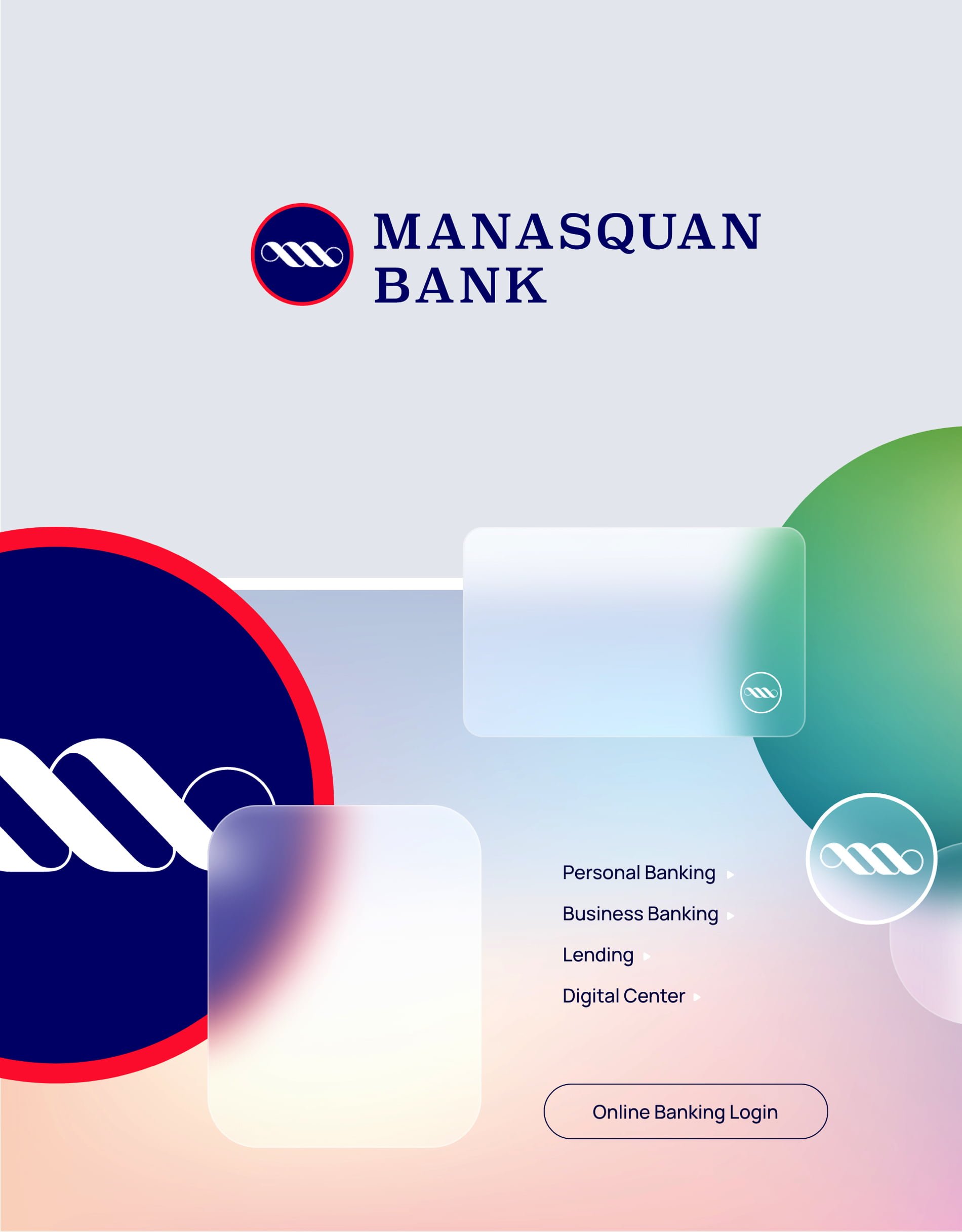


The voyage ahead.
With a refreshing and ongoing wave of message-driven advertising, content marketing, email marketing, and video production, this reverent, yet progressive brand ushers in a new era of Manasquan Bank—one that has seen the bank grow to 15 locations and counting while still maintaining its Main Street roots.