Aesthetics and Visual Design Elements
Understanding the Role of Aesthetics in Visual Design
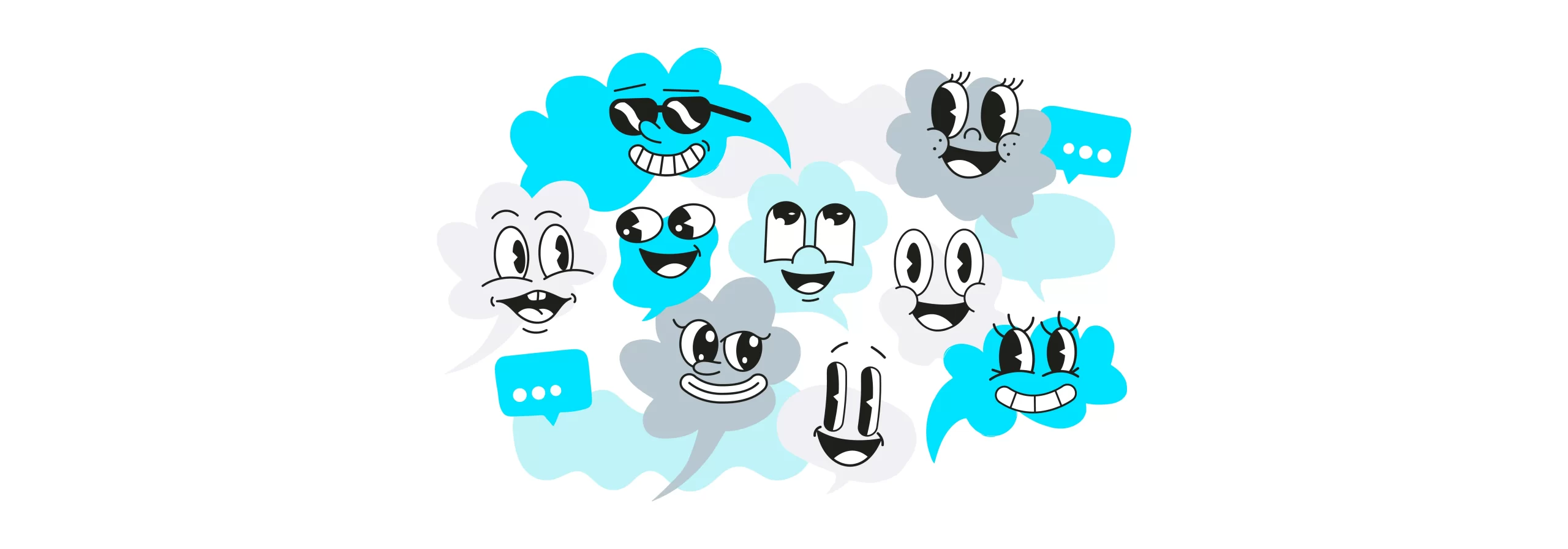
Visual design aesthetics are more than just surface beauty; they are critical in crafting engaging and effective digital experiences. As you seek to create visually appealing designs, it’s essential to balance aesthetics with user experience (UX) to ensure that your designs are not only attractive but also functional and user-friendly.
In this article, you will learn:
- Essential elements of visual design.
- Principles guiding effective visual design.
- Strategies for integrating aesthetics with usability.
We’ll explore how these aspects work together to create designs that are both beautiful and effective.
Fundamental Elements of Visual Design
Lines: Types and their Visual Impact
Lines are the most basic elements in visual design, serving as the foundation for creating shapes, textures, and patterns. From straight to curved, thick to thin, lines can convey motion, direction, and energy. They are pivotal in defining boundaries and creating a sense of order in a design.
Shapes: Geometric vs. Organic
Shapes, whether geometric or organic, form the core of visual compositions. Geometric shapes, like squares and triangles, convey a sense of stability and structure. In contrast, organic shapes, which are irregular and free-flowing, evoke naturalness and spontaneity. The choice between these shapes can greatly influence the mood and message of a design.
Negative Space and its Importance
Negative space, often overlooked, plays a crucial role in design composition. It’s the space around and between the subjects of an image and is essential for visual clarity. Proper use of negative space can enhance readability, create balance, and focus attention on key elements of the design.
Volume and 3D Aspects in 2D Design
Volume adds a sense of realism to 2D designs by simulating three-dimensional depth. This illusion is achieved through the use of shadows, gradients, and perspective, making elements pop out and appear more lifelike.
Value: Understanding Light and Dark
Value pertains to the lightness or darkness of a color. It helps in creating depth and highlighting areas of focus. By varying values, designers can create contrast and mood, and emphasize different parts of the design.
Color: Emotional and Communicative Aspects
Colors are powerful tools for conveying emotions and messages. Each color can evoke different feelings and responses. Understanding color theory and psychology is crucial for designers to effectively communicate the intended message.
Texture: Enhancing Visual Appeal
Texture in design adds a tactile dimension, making visuals more dynamic and engaging. Whether smooth, rough, glossy, or matte, textures can enhance the overall aesthetic appeal and make designs more relatable and realistic.
Principles of Visual Design
Unity: Creating Harmony in Design
Unity in design refers to the cohesive look that makes all parts of a composition feel like they belong together. Achieving unity involves using similar elements consistently and arranging them in a way that ties the whole design together, creating a sense of completeness and harmony.
Gestalt Principles: The Sum Over Individual Parts
The Gestalt Principles are based on the idea that the human brain will attempt to simplify and organize complex images or designs that consist of many elements, by subconsciously arranging them into a whole, rather than just a collection of separate parts. These principles, like proximity and similarity, help designers create coherent and meaningful designs.
Hierarchy: Establishing Visual Importance
Hierarchy in design helps guide the viewer’s eye to the most important information first. This is achieved by manipulating size, color, contrast, and placement. Establishing a clear hierarchy makes it easier for viewers to navigate and understand the content.
Balance: Achieving Visual Stability
Balance is the distribution of visual weight in a design. It can be symmetrical or asymmetrical, but it must create a sense of stability. Balanced designs are pleasing to the eye and make viewers feel comfortable.
Contrast: Enhancing Visual Interest
Contrast is the use of opposing elements, such as color, shape, or space, to highlight differences in a design. It’s a powerful tool to catch the eye, create emphasis, and make important elements stand out.
Scale: Managing Size Relationships
Scale refers to the size of elements in a design in relation to one another. Playing with scale can define a hierarchy, create visual interest, and help tell a story. It can also be used to create a focal point in a design.
Dominance: Focusing Attention on Key Elements
Dominance is the principle of emphasizing one element over others to draw attention or create a focal point. This can be achieved through size, color, texture, shape, or other design elements.
Integrating Aesthetics and Usability in Design
Balancing visual aesthetics with usability is essential in effective design. This integration ensures that designs are not only visually appealing but also functionally effective, enhancing user experience.
Legible Typography for Accessibility
Typography is a crucial aspect of design. Choosing clear, legible fonts and arranging text for easy reading is essential for accessibility. Good typography improves the readability of content, making it more user-friendly.
Color Contrast for Readability
Color contrast is vital for readability and user experience. High contrast between text and its background makes content easier to read and accessible to a wider audience, including those with visual impairments.
Brand Colors and Reducing Visual Clutter
Brand colors should be used strategically to enhance brand recognition while ensuring the design is not overwhelming. A minimalist approach can often reduce visual clutter, making the design more appealing and easier to navigate.
FAQs:
How do Lines Influence Visual Design?
Lines play a fundamental role in guiding the viewer’s eye and establishing the overall structure of a design. They can create movement, lead attention to focal points, and contribute to the overall mood. For instance, horizontal lines suggest calmness, while diagonal lines imply action or movement.
What Role Does Color Play in Conveying a Message?
Color is a powerful tool in visual communication. Different colors can evoke different emotions and associations. For example, blue often conveys trust and professionalism, while red can signal excitement or urgency. Understanding color psychology is crucial for designers to convey the right message.
How Can Balance and Contrast Improve a Design?
Balance and contrast are essential for creating visually appealing and effective designs. Balance provides stability and structure, while contrast draws attention and emphasizes key elements. Together, they ensure that the design is harmonious yet dynamic, guiding the viewer’s eye across the design in a pleasing manner.
Embracing Aesthetics and Usability in Visual Design
In this article, we’ve explored the delicate balance between aesthetics and usability in visual design. We delved into the essential elements that make up visual design, from the impact of lines to the emotive power of color. We also examined the guiding principles that ensure these elements come together harmoniously and effectively. Finally, we discussed strategies for integrating aesthetic appeal with practical usability, ensuring that designs are not only visually stunning but also functionally sound.
Key takeaways from this article include:
- Understanding the essential elements that form the foundation of visual design.
- Grasping the principles that guide effective and cohesive visual compositions.
- Learning strategies to balance aesthetic appeal with usability in design.
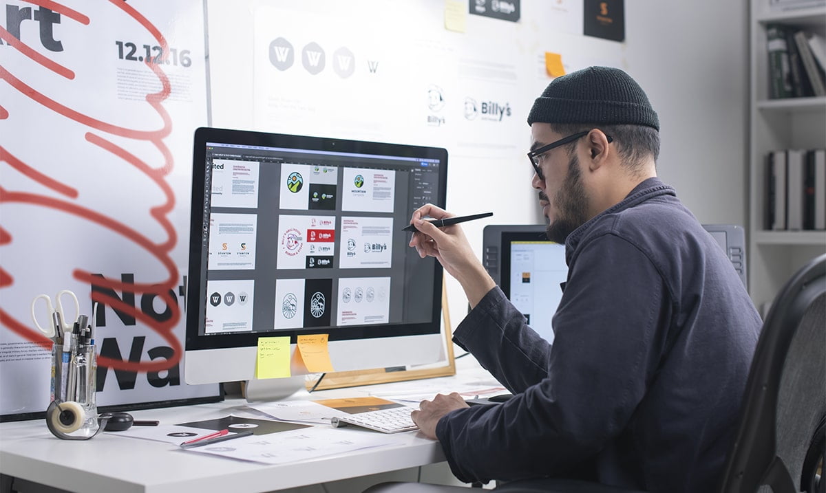
Visual Design Elements Creative Agency
If your website lacks engaging visual design elements or you have a new website design opportunity,